
Mapping political contribution networks
[build query] [about site] [news blog]
A Quick Visual Tour of Unfluence
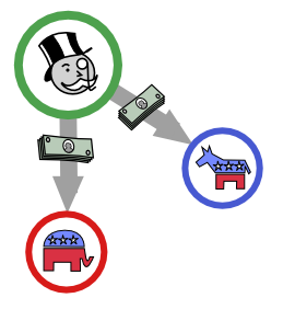 The Unfluence site constructs maps of the funding relations between groups of candidates and donors. The data come from candidates' required disclosures, collected and made available to the public by the National Institute on Money in State Politics (NIMSP). The basic idea is to help people understand the context of political giving, and the relative positions of various candidates in terms of who is paying for their campaign.
Building a Query
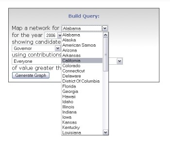 The first step to build a visualization is to go to the build query page and select region and race of interest, the
for example, California.
Then decide which year you want to look at (States have different election cycles, so data may not be available for every year) We are going to look at 2004.
Then you need to select what office race you are interested in. We are going to look at the relations among candidates running for State Senate.
At this point we can generate network map by clicking the Generate Graph button. It will take a few seconds while the system queries the NIMSP databases and constructs the network, you should see progress updates as it locates and processes contributors. [try this query]
Exploring the Map
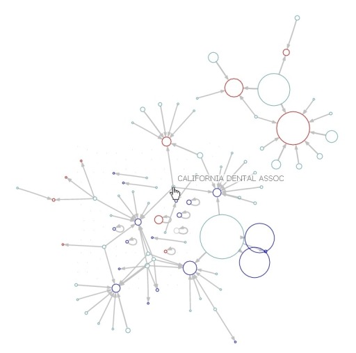
The program will return a map in which candidates and their contributors are represented by circles, with gray arrows showing the contributions. Red and blue circles stand for Republican and Democratic candidates. Green circles represent the contributors. The size of the circles is proportional to the total amount given or received. The algorithm that positions the nodes tries to place them as close as possible to their contributors.
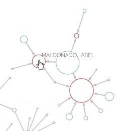
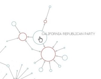
You can mouse over the circle to read the label on that node. If we examine the upper right corner of the image, we see that a large green node, the California Republican Party, gave a donation to a red node, Abel Maldonado.
VoteSmart Candidate Matching
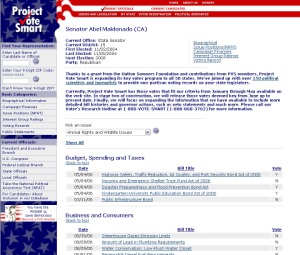
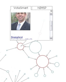 Clicking on Maldonado's node will bring up an information bubble with a photo and links to additional summary information. The data are gathered from the Project VoteSmart website, and includes links to a biographical sketch, issues position surveys, and voting records. (This information is only available for incumbents.)
Clicking on any of these links will load a page in a new window.
NIMSP Link-Back
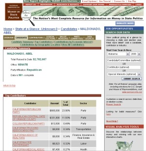
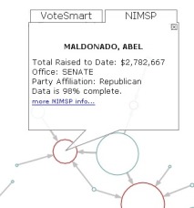 The NIMSP tab of the info bubble gives total funding ($2,782,667) and access to the National Institute on Money in State Politics page for the candidate, including lists of top donors (from which the network was generated) and state level summary data.
Influence Buyers
When we look at the overall graph, there are a number of interesting things to notice. One is that there are several candidates who just give to themselves (indicated by little "self-loop" arrows). There are also many contributors like the California Dental Association highlighted here, who give to politicians from both parties who are competing for the same office.
Digging Deeper
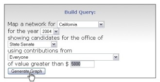
 In our initial query, we left the "of value greater than" field at its default of $10,000. This means that contributors who gave less than $10,000 were not included in our map. We can now go back and change this, moving the threshold down to $5000. [try this query]
This produces a network map that is much denser and more detailed, with many more contributions and contributors visible in the network. Because node positions are determined by their ties, most of the nodes have moved as well. Notice also that there is now a fairly clear division between the parties, with most of the Republican candidates on the right and Democrats on the left.
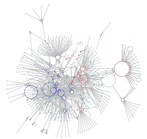
If we explore this network a bit, we find that the two biggest contributors (the largest green circles) in the categories we have chosen are the Republican and Democratic parties. We also see more of these interesting middle nodes, such as the pharmaceutical company GlaxoSmithKline.
Drilling in on an Industry
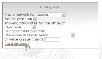 Suppose we want to find out more about companies like GlaxoSmithKline. The NIMSP data includes category information for each of the contributors. So we can can go back and edit our query and limit it to include only contributions from Pharaceuticals & Health Products companies. Because this will make a graph that is much less dense, we will also set the contribution threshold down to $0 so everything will be included. [try this query]
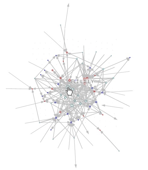 Check out the three candidates closely grouped in the upper left. Although the layout algorithm is not entirely dependable, it is likely that their close positioning indicates that they recive very similar patterns of contributions. It would be interesting to compare their voting records by using the VoteSmart links...